ShopDreamUp AI ArtDreamUp
Deviation Actions


Suggested Deviants


Suggested Collections


You Might Like…


Featured in Groups


Description
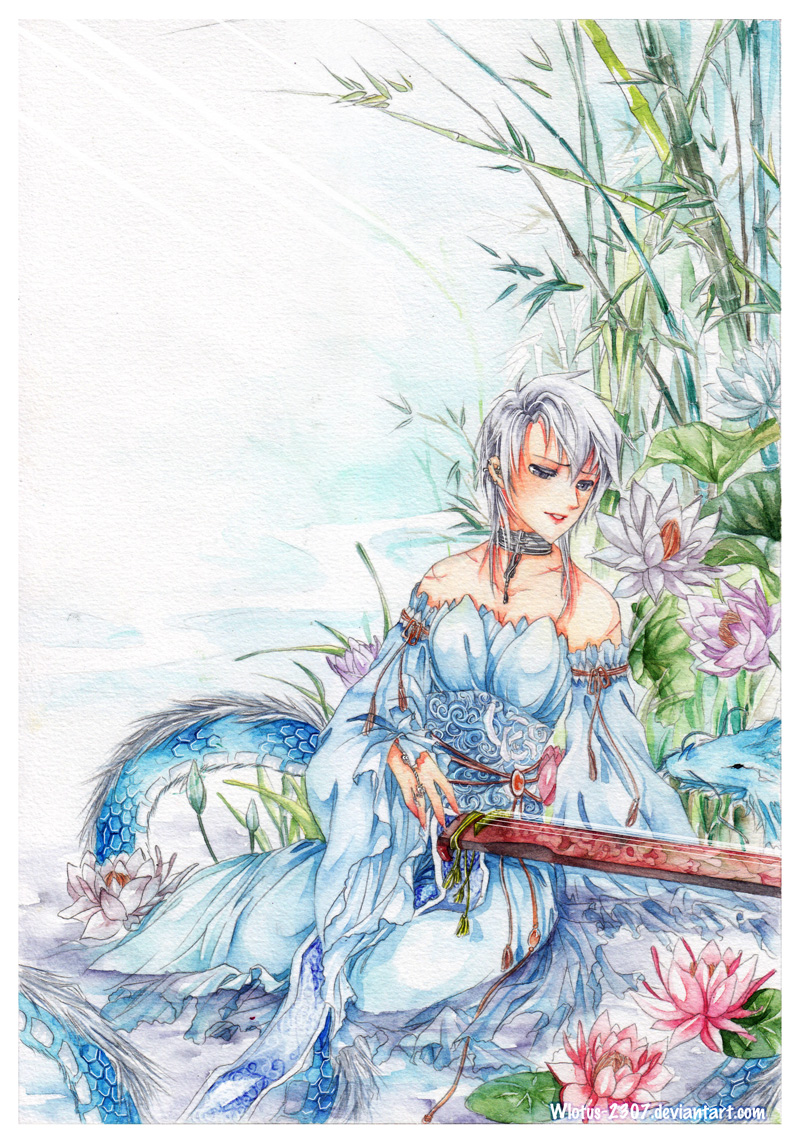
Watercolor commission for  . She asked me to color her sketch commission I did. Her OC Shenlong I totally fall in love with her ♥
Thank you for commission me dear . Hope you'll like it
Ignore about the logic in this pic, plz
Lại vớ phải giấy mốc, ps quả là thần diệu mà ~
~
_________________________
 My commission: [link]
:thumb203151580:
. She asked me to color her sketch commission I did. Her OC Shenlong I totally fall in love with her ♥Thank you for commission me dear
Ignore about the logic in this pic, plz
Lại vớ phải giấy mốc, ps quả là thần diệu mà
_________________________
:thumb203151580:
Image size
800x1143px 469.91 KB
© 2011 - 2024 Wlotus-2307
Comments234
Join the community to add your comment. Already a deviant? Log In
I'll have to say this is one of the best water colour artwork i've seen so far<img src="e.deviantart.net/emoticons/b/b…" width="15" height="15" alt="
For vision, i've rated it 4/5 because although it reflects an idea + theme, the meaning isn't al that clear to me at first glance. Her dress stands out more than her face, and so, her expression. The instument is a good contrasting element, but it didn't actually occur to me what instument it was, until i studied the work more throughly. Perhaps revealing more of the instument will help, although it may spoil the atmosphere if the contrasting element was too strong.
For originality, i've rated this 4 out of 5, simply because this idea/ theme is used quite frequently, when addressing the particular chinese instument (which i've forgotten the name of -sorry >.>) The mood + atmosphere used in this artwork is also typical of the instument and the lotus + dragon are symbols typical of it's origin, so i wouldn't say this is very original. But the mere fact that you decided to incorporate the symbols into this artwork and make it more obvious to what the artwork will be about, is far more pleasing than if you had decided to use something completely off the topic. Good job<img src="e.deviantart.net/emoticons/s/s…" width="15" height="15" alt="
For technique, again i rated it 4/5. I can't say that I'm an expert on watercolour paintings but i've seen enough to say that you could've done better on the water<img src="e.deviantart.net/emoticons/s/s…" width="15" height="15" alt="
I rated your impact, 4.5/5 because it did provoke a very strong emotion in me, although that may be, because of my context. It was a wonderful idea to have the sky more vague and put more details on the bottom of the page, but perhaps you put a bit too much. I understand that you want to draw more attention to the bottom half, while remaining a nonchalent + tranquil feeling, but the artwork seem SLIGHTLY off balance. I emphasis slightly because you handled it ver skillfully. Maybe a something else on the top half will balance it out:3 It doesn't have to be very big.
I think you handled the colours and the vectors very skillfully but the bit of the dragon on the left side of the girl, attracts my attention more than the actual girl. When i first looked at the artwork, i instantly saw the dragon before my eyes strayed to her face. The lotus blossoms were a wonderful contrast to the blue, while at the same time remaining harmonious to the artwork. They were a good idea to put in the foreground but maybe putting slightly bigger ones will get a better idea of proportions? that's only if you're after it<img src="e.deviantart.net/emoticons/s/s…" width="15" height="15" alt="
I would say this artwork attracts attention with it's variety of colours that compliment each other, and then the details insist the audience to have a closer look which will then show the finer adjustments + the skill of the artist. Well done<img src="e.deviantart.net/emoticons/b/b…" width="15" height="15" alt="